An editorial exploration that challenges traditional newspaper formats. 'FOKUS' was designed to capture the rebellious, auteur-driven spirit of BAFICI 2023. Through rigorous typographic systems and a bold duotone aesthetic, the project translates the cinematic medium into a tactile, printed experience.
The publication frames the independent film festival through an analytical and auteur-centric lens. By spotlighting Quentin Tarantino, the newspaper positions itself as a deep-dive into the craft of filmmaking.

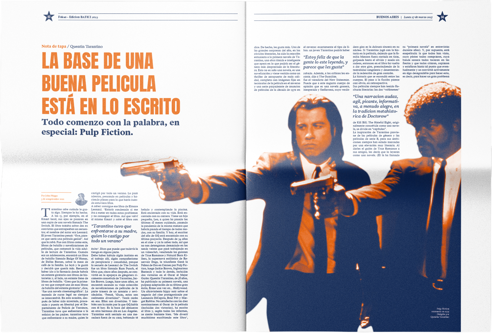
The design breaks away from traditional black-and-white newsprint by utilizing a striking, high-contrast duotone palette. Deep Navy Blue grounds the design with a vintage film-noir quality, while Vibrant Orange acts as an aggressive accent color that demands attention.

A masterful typographic hierarchy guides the reader's eye across a classic multi-column grid. The masthead uses a heavy, cinematic serif, while headlines utilize a tightly tracked, bold, condensed sans-serif to create impact.
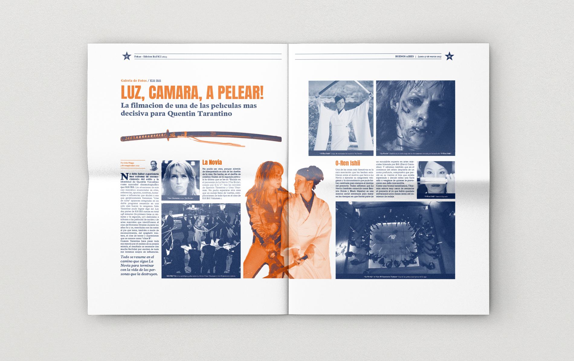
The layout respects the traditional broadsheet grid but elevates it with modern editorial flair, featuring dual-exposure centerpieces that break the rigid columns to create visual drama.
