Large-format poster design for the grand opening of Motoplex Leloir in Buenos Aires — two iconic Italian brands, two distinct visual worlds, one showroom.
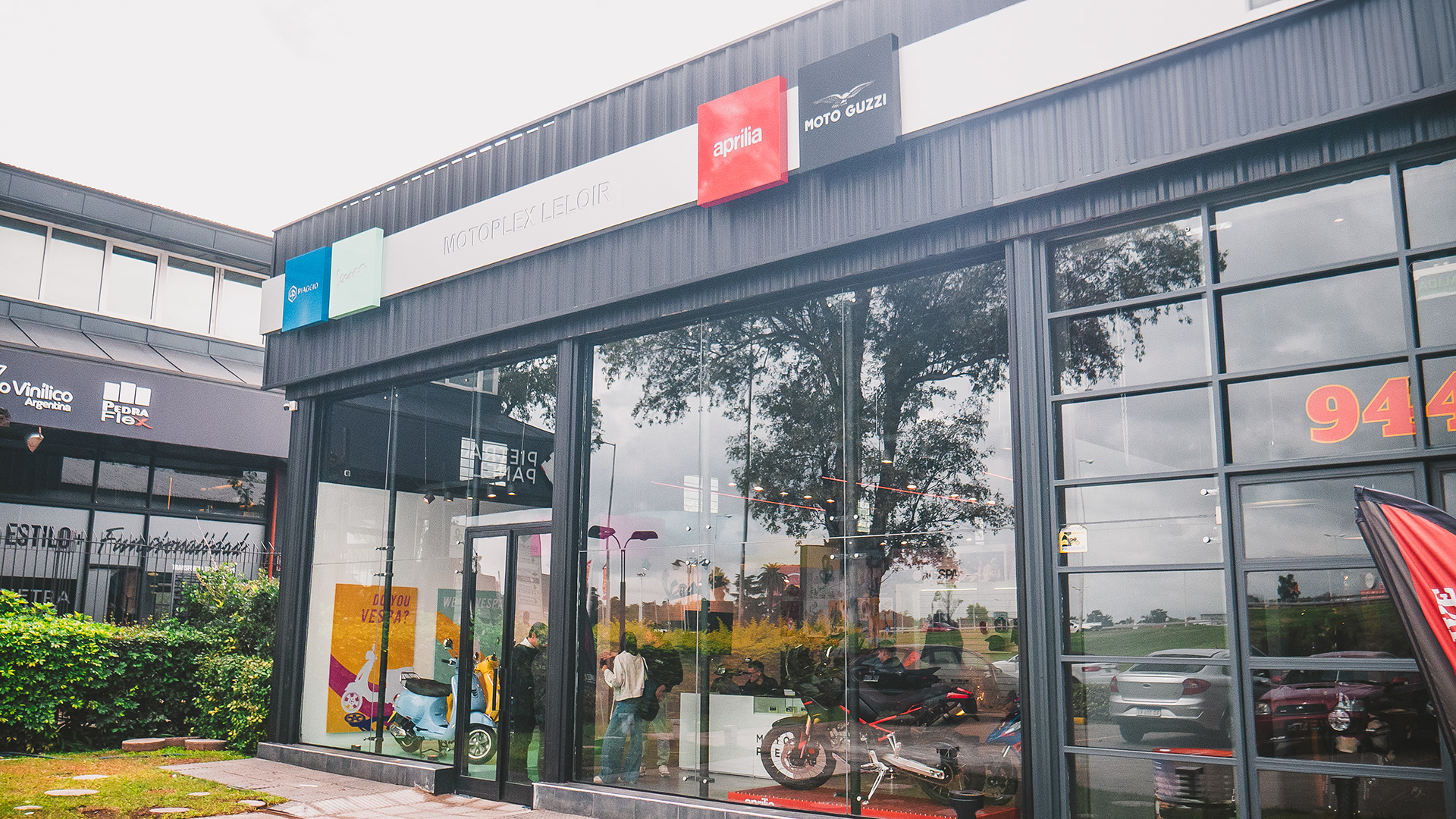
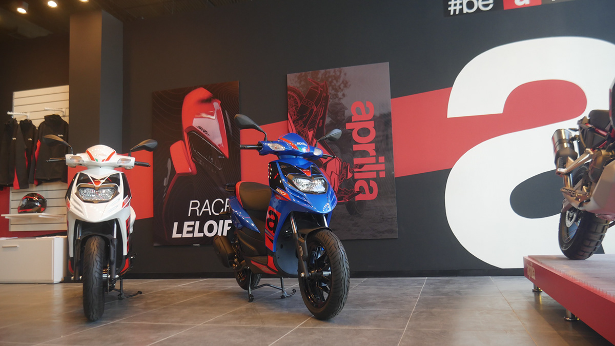
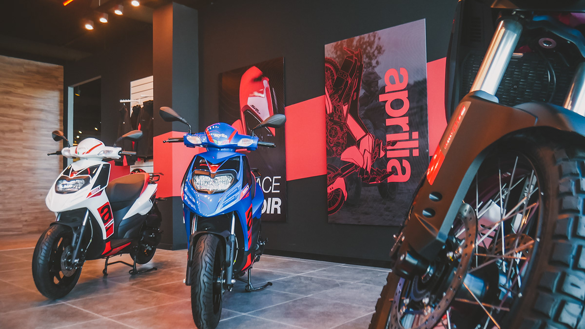
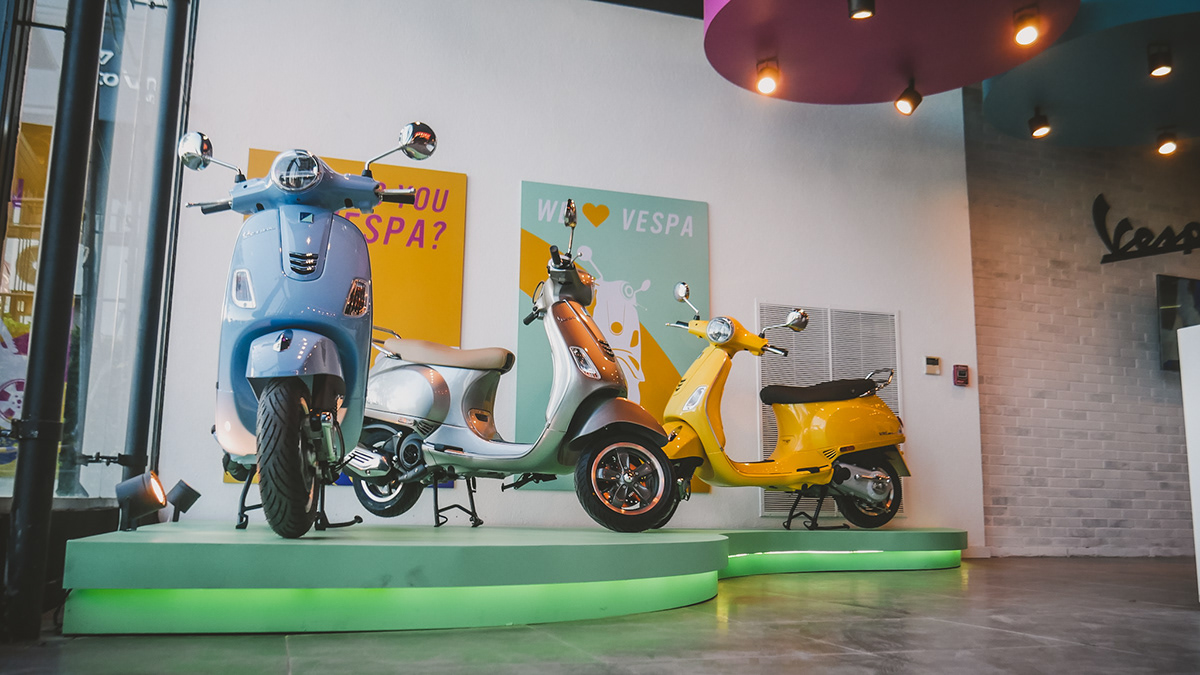
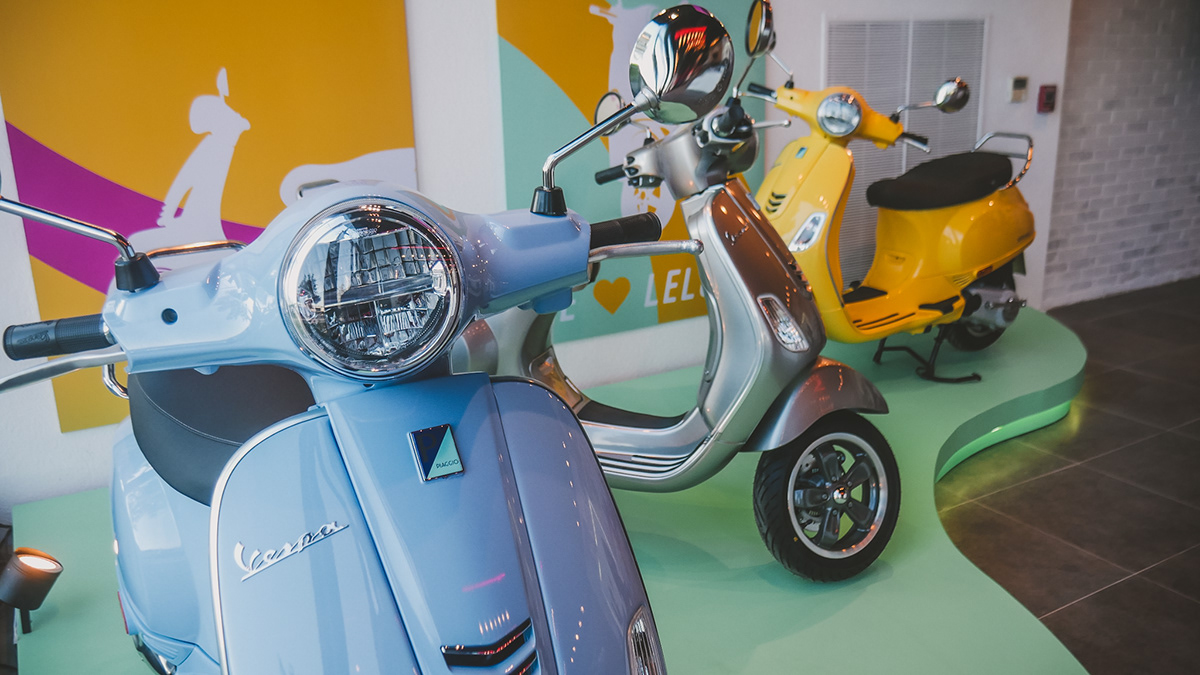
Motoplex Leloir is a multi-brand dealership in Buenos Aires that houses both Aprilia and Vespa — two very different brands under the Piaggio Group umbrella. For the showroom's launch, I was tasked with creating large-format posters that would be displayed on the showroom walls, setting the visual atmosphere for each brand's dedicated space.
The challenge: two brands with radically different identities — one aggressive and race-driven, the other playful and lifestyle-oriented — each needing to feel distinct while coexisting in the same physical space.
For Aprilia, I adopted a dynamic and assertive aesthetic. I utilized a bold red-and-black color scheme for the posters, featuring the Aprilia logo alongside powerful phrases like "RACE Leloir" and Aprilia´s Logo. All aligned with Aprilia’s branding guidelines.
The headline "RACE Leloir" anchors the Aprilia space with a sense of place and brand pride, while the oversized Aprilia wordmark creates an unmistakable identity statement that's visible from the street through the showroom's glass facade.
Every design decision was aligned with Aprilia's official brand identity. The typefaces, color values, and logo placement all comply with Piaggio Group's brand standards for the Aprilia marque — ensuring the posters feel like official brand material, not third-party work.
The posters came to life in the Aprilia section of the showroom, flanking a display of the brand's scooter lineup. The "RACE LELOIR" poster serves as an immediate focal point as customers enter the space, reinforcing the dealership's location-specific identity.
A wider view of the Aprilia section shows how the poster system works across the full wall — the large typography and red diagonal elements create a dynamic composition that reads well at any viewing distance, from across the showroom to up close.
Vespa required a completely different approach. Where Aprilia is defined by speed and precision, Vespa is about joy, style, and the Italian dolce vita. The posters for the Vespa section embrace a vibrant, multi-color palette — featuring playful headlines like "Do you VESPA?" and "We Love Vespa".
The color scheme draws from Vespa's established brand palette of purple, green, yellow, and orange, creating a lively atmosphere that perfectly matches the three scooters displayed on illuminated green platforms below the posters.
The Vespa posters were designed strictly within Vespa's official brand guidelines. The approved color palette, typefaces, and logo treatments were all sourced from Piaggio Group's brand assets, ensuring the designs could be approved as official brand-compliant collateral.
The Vespa section of the showroom is transformed by the posters. Three Vespa scooters — in a powder blue, champagne silver, and mustard yellow — sit on sculptural green platforms, while the "Do you VESPA?" and "We Love Vespa" posters behind them create a cohesive, Instagram-worthy brand moment.
A closer look at the Vespa display shows how the poster colors harmonize with the scooters' own paint finishes. The warm tones of the orange poster reflect in the champagne Vespa's chrome trim, while the green platform ties the entire composition together.